Wednesday, March 19, 2008

Jewellery Logos


The logos for Michael Hill and Magnani are similar in their target audience - the logos give off a very clean and sharp image - a classy image.

Whereas Kincaid Designs gives off a more homely sense - more traditional and handmade feel (which is in fact what they do). Also the choice of the circular design rather than the quadrilateral that the others go with - the square is more contained, and gives off a more resolved logo.

Jewellry Shop Identity


Saturday, March 15, 2008

Myer competition..


David Jones is a higher market choice than Myer in my opinion, but i guess it closest to it in the market in some respects. Similar clients, similar prices and similar stock. Whereas David Jones is more of a metropolitan-based company - whereas Myer spans into the smalller centres (ala Wagga)


Target is lower market than Myer, more of a generalist store, and cheaper. More relatable to Big W rather than Myer. But they have more of an appeal to the general public than Myer due to their prices, although the service isnt as good at times... But then again all they're trying to do is sell you stuff at Myer.


Kmart is similar to Target in the sense that they appeal to a different client again, but Kmart is different to Target through its products. You will find more variety at Kmart and more of a product range.

Reading Response:


Logo Redesign


Thursday, March 6, 2008

Logo/Logotype musings..

Square/Circle/Triangle


Bluebox Entertainment's logo plays on the basic geometry of a cube (squares =p). Its incredibly simplistic, but works nicely with the inclusion of its 'reflection' below the shape itself. It presents what i feel to be a very strong an
d solid image - sending a message of strength and reliability through the logo.


Microsofts 3rd generation gaming console the Xbox 360 uses a logo which is an example of good use of a circle. The name of the product directly links with the logo through the shape (sphere) used. In comparison to the logo for the previous console, the Xbox.


The original Xbox was a black console, whereas the 360 was white. This change was represented in the logo. But the main change was taking the already existing logo and wrapping it around a sphere, representing 360 degrees.

I felt that this was an effective solution to the issue - taking the logo that the consumers were already familiar with, and adapting it into the new one.


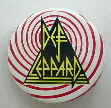
I dont agree with Def Leppard's use of the triangle in their logo, i dont fell that i works well with the imagery at all. It comes off as chaotic, and seems meaningless.

I think that of the 3 shapes the triangle would be the hardest to adapt to a logo. I think that it would have to represent something for it to work effectively within the image.

Reading Response:

A plumber would need an identity that clearly states why you should choose him over any other plumber.

Reliable, good work ethic and friendly would be a way to appeal to potential customers. The need to differentiate from the stereotypes is at fore in this particular case, everyone's heard a story about a dodgy tradesperson ,and you dont want to be suspect of that due to your companies appearance through their logo. A healthy advertising campaign would also assist, a quote like 'your local friendly plumber' will only do so much whereas 'reliable, efficient and friendly - plumbers inc' (etc) would send more of a message i feel.

But im terrible at slogans..

Difference between logo design/corporate identity/branding?

Logo Design
is a part of corporate identity/branding - a tool used for the instant recognition of the brand or company (McDonald's 'golden arches').

Corporate Identity is the representation of the company's identity as a whole.

Branding is where your product is viewed as the only product that meets the consumer's needs for that particular niche of the market.

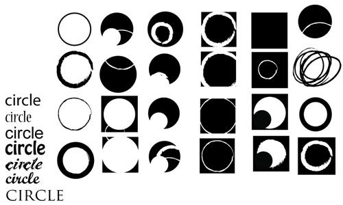
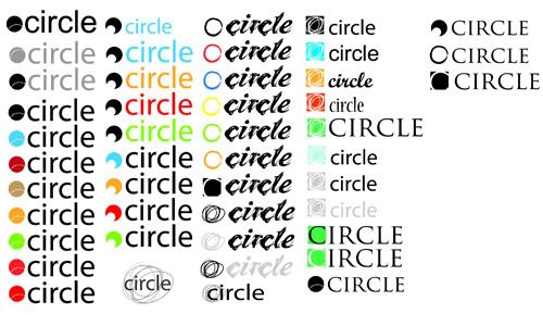
Circle circle circle...circle


Tuesday, February 26, 2008

Company Logos

Company Logos

PIXAR Animation Studios


I've always been a fan of the Pixar logo. It has intense feeling of... cleanliness, or sterility even. I have long had a soft spot for Pixar, since the Toy Story days really, and what i liked most about their logo was how they applied it to their films.

Stand-alone, the text is fine - they use only the text for the signage outside their studio, but the incorporation of the lamp is something that is (in my eyes) vital to the companies image. They strive to be the best at what they do, and this is shown through the quality of their logo.

If you went to a Pixar film and it opened with just a still frame which had PIXAR written there in comic sans, and you had to look at it for a good 10 seconds you'd think that it was a tad shit. Which in turn would affect how you view the film. So their attention to the logo is a sign of their professionalism - and including the lamp is also a nod to their first animation Luxo Jr. ( watch Luxo Jr)

Now after saying all that, i can understand why they have the 2 different versions - the one they use in film is always going to be seen as a the more recognisable one. But just the logotype by itself must be used for business cards, letterheads etc because if you shrank the lamp down to fit on a business card the logo as a whole would get awfully cramped damned fast.

Industrial Light and Magic


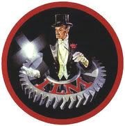
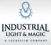
The logo on the left is their original logo, on the right is the current logo.

When comparing these 2 you can really see the progression that time has brought round to the logo. But at the same time you can also see that they have kept a similar idea throughout the various changes that have resulted in the current logo.

The idea of creating 'movie magic' is clearly displayed by the magician in the earlier logo, whereas in the current one it is far more subdued - with the lightbulb imagery playing off the creative and 'ideas' angle. Also the use of the full company name rather than its initials has a more resounding effect for me - purely because more people are less likely to confuse INDUSTRIAL LIGHT AND MAGIC with the possible magic show implied by ILM (when accompanied by the magician image).

Unlike PIXAR you dont see ILM displaying their logo at the beginning, or even at the end of their films. This is because unlike Pixar, they dont create the entire film - but they also let their work speak for itself. Rather than showing a dirty big logo and have people go 'theres gonna be some kick arse special effects in this!' and sit there trying to spot it all instead of watching the movie - ILM downplays its involvement and just pops their name in at the end - and people are left wondering what was real and what wasnt.